How does increasing your chance of getting a job offer by crushing your next interview sound?
Amazing? Refreshing? Calming?
Whatever that feeling may be, we’re here to share our tips on how you can stun your interviewers with impressive excel skills.
We have collectively interviewed 600 people over our 40 combined years in the professional world at every level.
When you work at hypergrowth companies, you can have as many as 5 interviews in a day, so yes our number isn’t an exaggeration.
We were also business partners with HR teams, which helps you get on interview committees. 🙂
Now let’s dive in and get you hired.
So how do you stand out?
Standing out in a sea of highly qualified candidates is a tall order. So we feel your pain.
In all of the interviews we’ve conducted, one particular FP&A interview stood out the most.
We presented a case study question, and this person did their homework. They presented information clearly and succinctly that made us say “you’re hired” the same day they interviewed.
How did they do it?
Using sensitivity tables. 💻
The best part? Anyone can make this visual in under 2 minutes.
Now let’s jump into how you can create these tables.
What you need
Here are 3 shortcuts that will make life super easy when it comes to creating data tables and conditional formats.
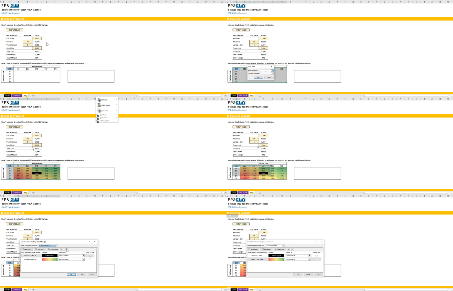
We recommend writing these down on a sticky note, pasting them to your monitor, or using tools like Notion or Clickup.
- ALT + A + W + T OR ALT + D + T [Create Data Table]
- ALT + H + L + S [Conditional Formatting Color Scales]
- ALT + H + L + N [Conditional Formatting New Rule]
If you’re a visual learner follow along using the file we provide below OR open your own excel file.
Let’s get started.
Step 1: Create a simple formula
Let’s say our goal is to calculate ABC Startup’s Gross Margin with the following inputs:
- Users
- Revenue
- Variable cost
- Fixed costs
Our sensitivity table is going to tell us how gross margin is impacted when these inputs change.
“What happens when users increase?”
”What happens when variable costs increase/decrease?”
Using our newly created Gross Margin model, pick a cell and have it link directly to the gross margin result simply by hitting “=” and the cell.
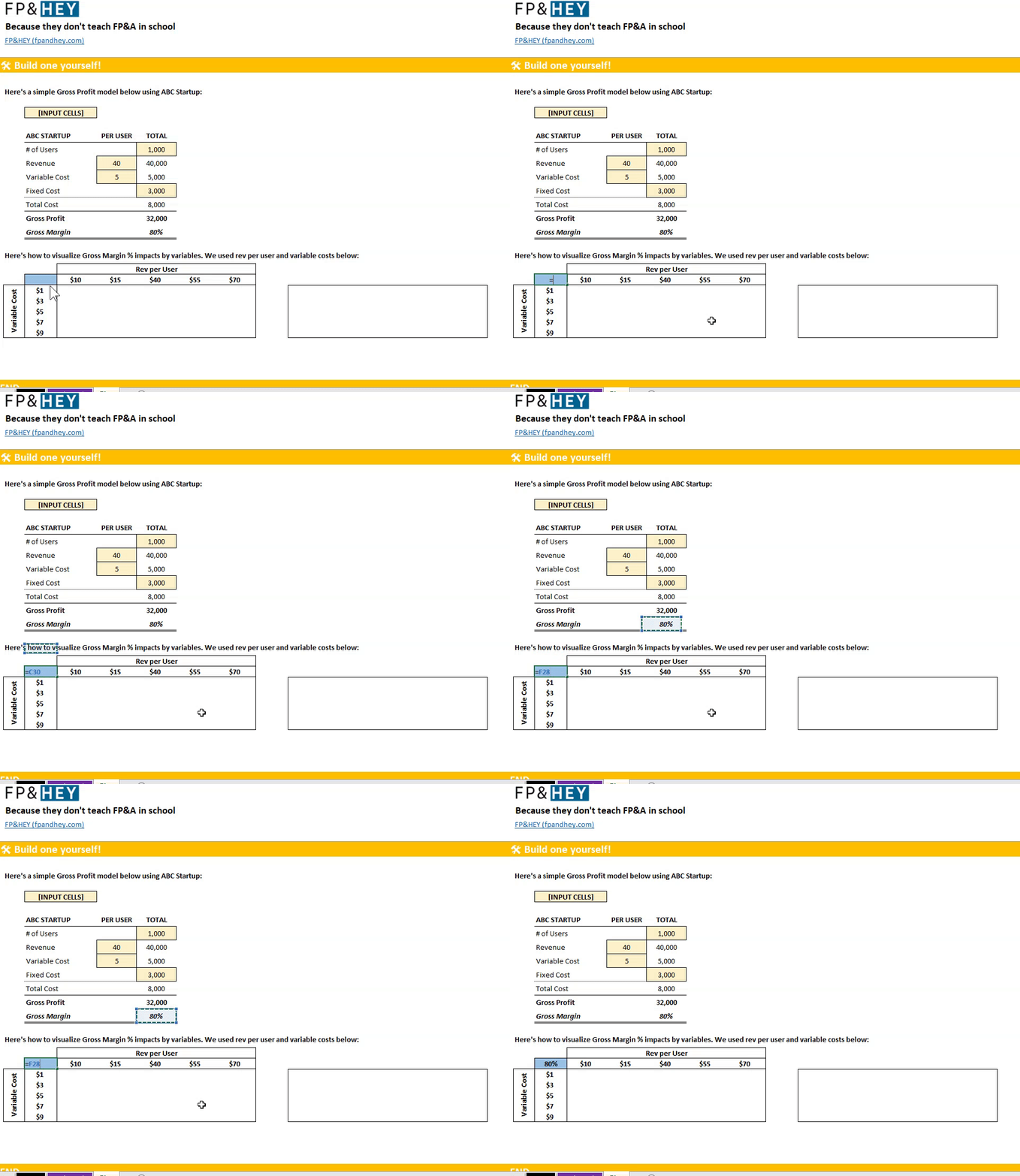
Nothing pretty or functional yet. But don’t worry, we’re only 90 seconds away!
Step 2: Identify variables to test your sensitivity analysis
In the rows going across create 5 columns with values that you want to test. We chose revenue per user.
Do the same thing for the 5 rows going down. We chose variable cost.

One of the values you choose in the rows and columns needs to match what’s in your original formula on the left.
We input $40 in rev per user and $5 for variable cost.
Now the fun stuff. 💪
Step 3: Create a data table
Highlight the area where the data table will live.
In our example, highlight the 80% blue cell all the way down to the $9 variable cost and all the way across to the $70 Revenue per User.
Hit ALT + W + A + T or ALT + D + T (here’s where excel shortcuts save you precious time that add up).
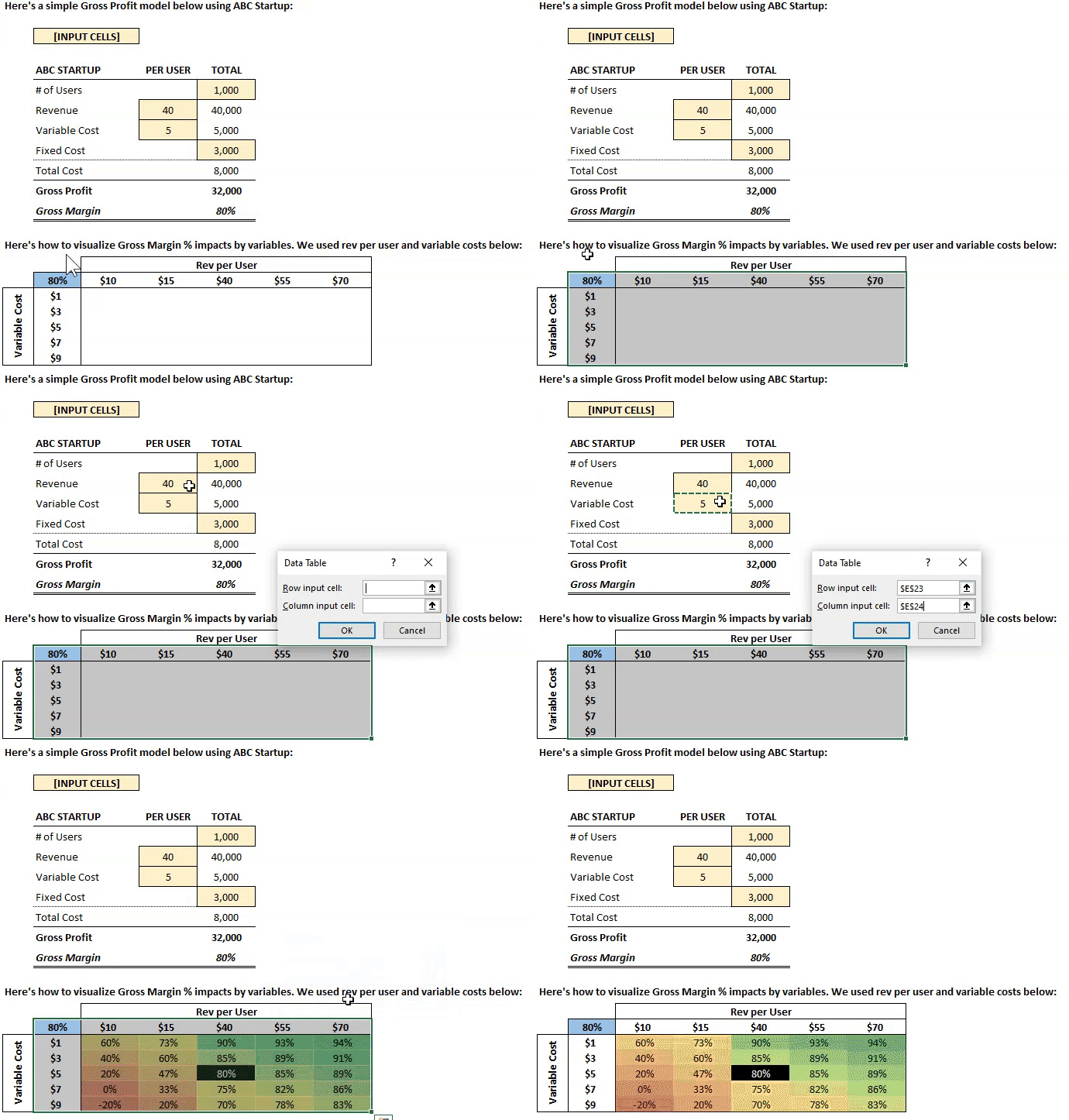
Link the row input cell to your $40 rev per user cell. It’s important to link the correct row and column input cells, or else your sensitivity analysis won’t calculate properly.
Now link the column input cell to the variable cost per user input of $5.
Click OK and watch your data table take shape.
In the gif above, you can see where 80% gross margin where $40 rev per user intersects with $5 variable cost intersects.
It worked!
You now also have an idea of how gross margin changes as rev per user goes up and down. Same with variable cost or any other variable you decide to layer on.
Now let’s make this even easier for our friends and business partners to consume the data. 🔍
Step 4: Add a splash of color
To make data pop, we use conditional formatting.
Conditional formatting makes it easy to highlight certain values or make particular cells easy to identify. E.g. if the cell is greater than zero, change cell color to green.
With these, our business partner friends can more easily consume our data.
Now let’s create a conditional formatting rule to make our data pop.
Highlight the data table figures. In our example, the 60% in the top left all the way to the 83% in the bottom right.
Hit ALT + H + L + S + ENTER → This creates a color scale.
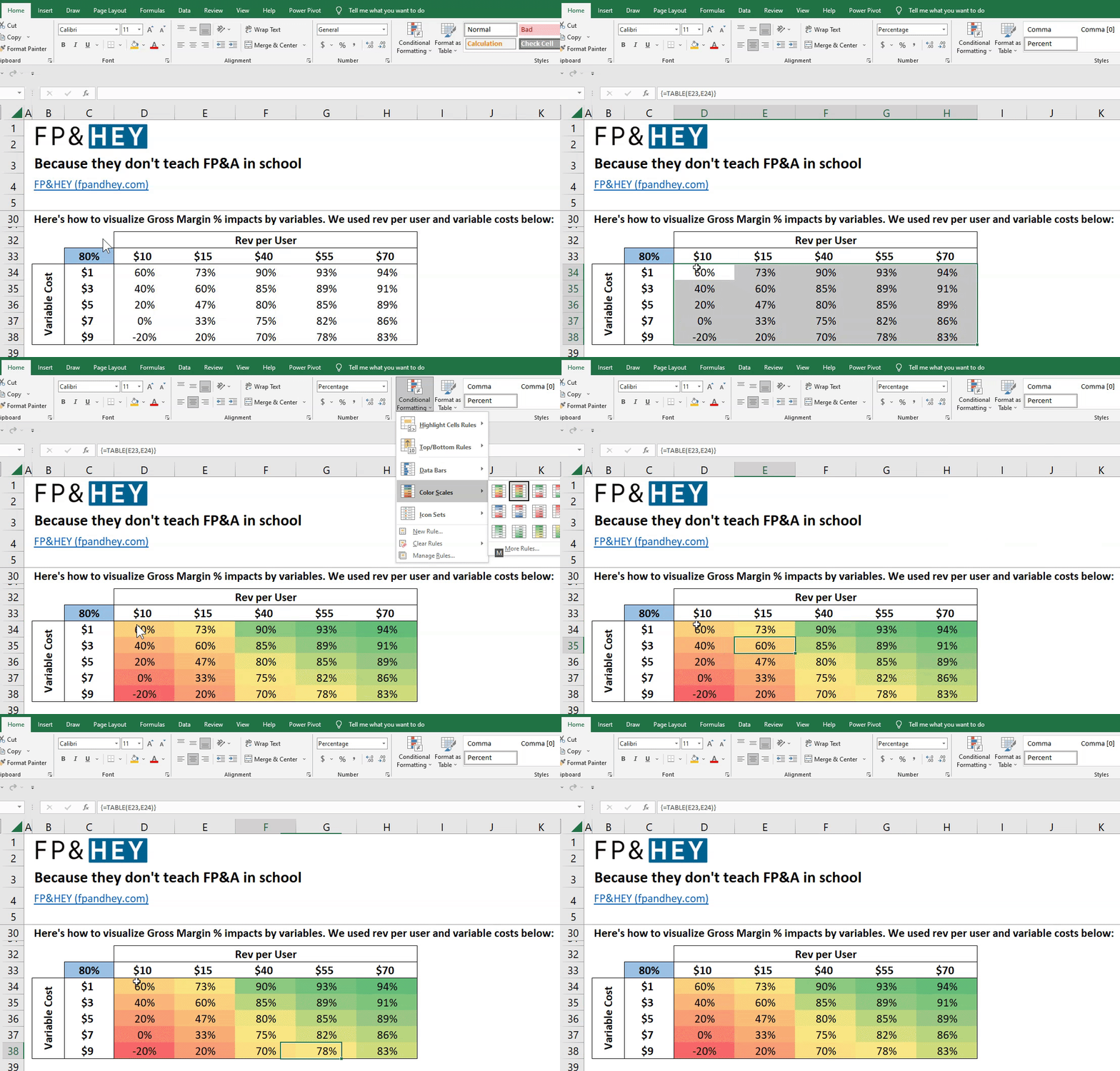
Our visual is coming to life AND is super functional.
- GREEN = high gross margin vs current inputs.
- RED = lower gross margin vs current inputs.
We can also see where a break-even exists at 0% Gross Margin ($10 Revenue per User and $7 Variable cost).
But wait, there’s one more trick up our sleeves that takes this visual to the next level.
Step 5: Ground your audience in current assumptions
Highlight that beautiful visual one more time and add one more conditional formatting rule.
Again, highlight the data table figures. In our example, the 60% in the top left all the way to the 83% in the bottom right.
Hit ALT + H + L + H + E → Then connect the cell to your Gross Margin output of 80% above.
Now update the format to black fill and white letters.
See the gif below visually showing how we achieve this:
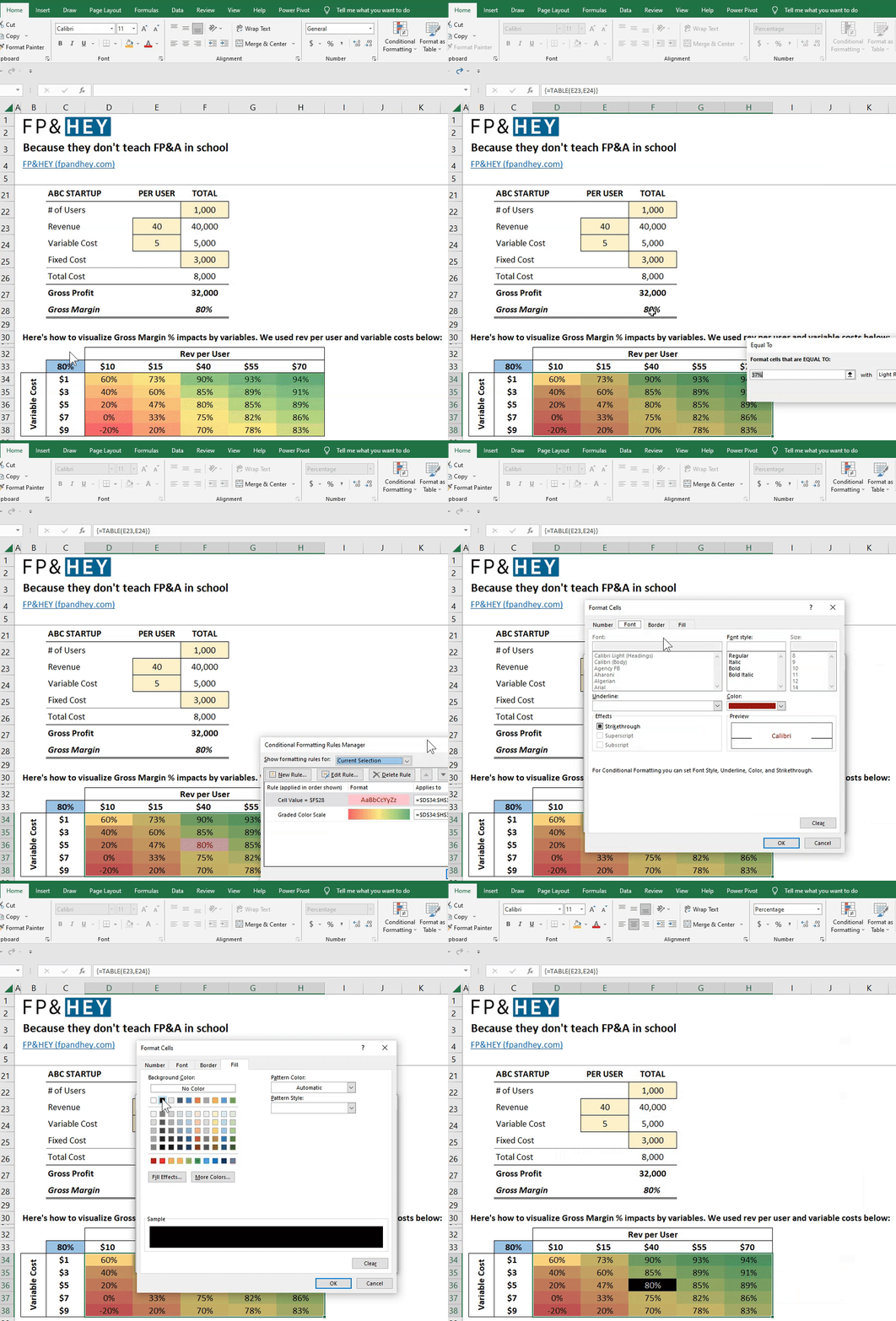
We’re visual learners too. 🙂
And BOOM, your sensitivity table now tells your audience where the current assumptions land by emphasizing it in black and white.
Our simple formula gets us to an 80% gross margin, and it’s evident in the sensitivity table.
But wait, there’s one more thing!
Change your simple formula input to match a different number in your table, and watch what happens. We updated revenue per user to $55 and variable cost per user to $3.
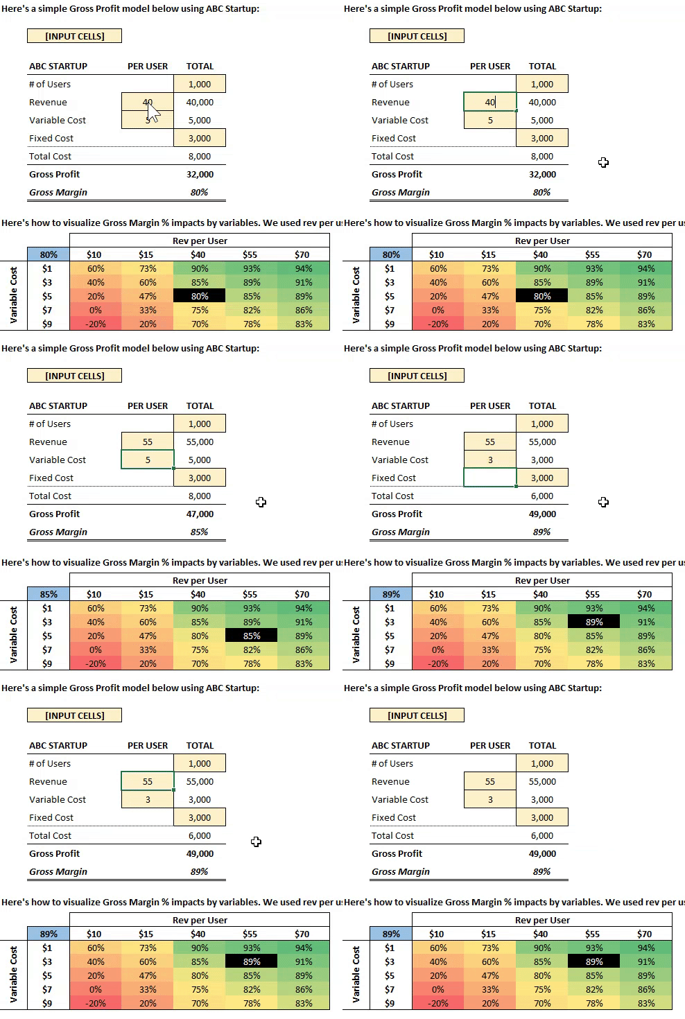
Notice how the black formatting follows your inputs…

Note at any point you can change the values in the row and column headers in case you want to match different variables in your formula.
Conclusion: Crush your interview with confidence
Imagine you’re in an interview.
And you’re walking them through this simple visual and model.
You tell them how much profit they can expect given certain assumptions.
You tell them how much MORE money they can make by changing certain assumptions.
Oh, and you tell them your models are dynamic, so working sessions with people that own the assumptions will be VERY productive.
As FP&A professionals, we have so much data to analyze. The trick is to make it simple to understand and actionable to drive better results.
A picture can say 1,000 words or articulate 1,000 scenarios.
You only have minutes to impress people in an interview or presentation.
Use these functions in excel to QUICKLY tell a story of how a business can impact its results by working towards certain KPIs (key performance indicators).
And don’t forget to use these shortcuts we’ve shared to do it with minimal prep time.
How do you feel now? Pumped for that next interview?
Let us know by replying here or emailing us. If there are specific topics you’d like us to cover as well, let us know!
Now go have fun making an impact on your business and your career!
Cheers,
Drew & Yarty
PS: This post is 100% human-made

