Hey there,
First, thanks again everyone for sharing your feedback on our poll a few weeks ago!
Stay tuned as we have tons of helpful, practical content tailored to boost your FP&A game scheduled in the pipeline.
Now onto today’s post: how to use bubble charts as the ultimate customer renewal tool.
This post will help you understand 4 things:
- What are customer renewals
- What are bubble charts
- How to find actionable insights using bubble charts
- Follow along and learn how to build your own bubble chart
Visuals help you make data actionable.
Want to help your Customer Renewals (or Success/Operations at other places) team take action and drive revenue?
Of course you do.
Let’s dive in.
Customer renewals are important
Pop quiz…what’s cheaper?
🅰️ Retaining an existing customer
🅱 Acquiring a new one
Answer: 🅰️ every time.
Your company spends A LOT of money acquiring customers.
The longer you keep them, the more revenue and value they generate.
This concept is also known as CLTV (Customer Lifetime Value).
That’s why customer renewals are so important.
And you should know certain things about a customer before they renew:
- How much revenue do they generate?
- How much profit do they generate?
- When is their renewal date?
Why is this information important?
It helps your Customer Renewals team take specific actions on renewal.
You could give your Customer Renewals team a data table with the info like this:
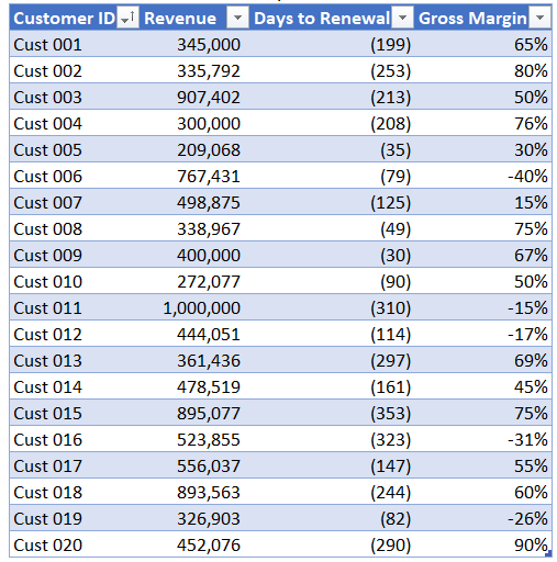
…but that isn’t going to tell them much without some digging.
Now there is nothing wrong with a good data table, it’s an Excel best practice.
But you want to package the information with actionable insights.
That’s what FP&A business partnering is all about.
That’s how you get noticed and get promoted.
So put your best foot forward when presenting your financial info.
Ask yourself,
“How should your Customer Renewals team handle each customer?”
❓ Auto-renew regardless of price
❓ Increase price by a certain amount
❓ Selectively churn due to negative profits
A bubble chart enables targeted action by evaluating such possibilities.
How bubble charts work
Who doesn’t like bubbles?
A bubble chart displays data as bubbles.
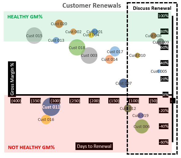
In our example, customers are the bubble.
The size of the bubble represents certain attributes.
So does the position of the bubble on the X and Y axis.
Let’s start simple.
The bubble
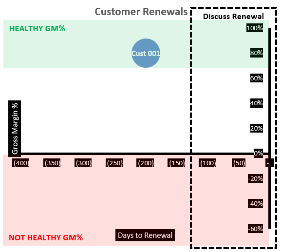
Here is one customer on our bubble chart.
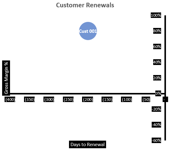
The bubble represents Customer 001.
This chart isn’t that exciting…yet.
The Y-axis
The Y-axis represents Gross Margin %.
Gross Margin % = Gross Profit / Revenue
It’s a profitability metric used in things like deal calculators.
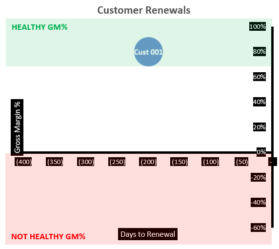
Above ZERO % is profitable, and below ZERO % loses money.
Let’s say your company has the following guardrails:
✅ +70% = healthy
❌ Below ZERO % = not acceptable
Customer 001 would be in the GREEN and considered healthy.
Ok, now we’re getting some interesting data.
But we can do better.
The X-axis
The X-axis represents days to renewal.
Day ZERO is THE day of renewal.
Customer 001 is at minus 200 which is 200 days away from renewal.
Let’s say your company targets renegotiation discussions 100 days pre-renewal.
Customer 001 isn’t in the window for renewal discussions yet.
Now we’re triangulating multiple data points, not bad.
Let’s get nuts and bring in all the data.

Bubble size
Bubble size = Revenue rank relative to the rest of the customer population.
This doesn’t mean much with only one customer on the chart.
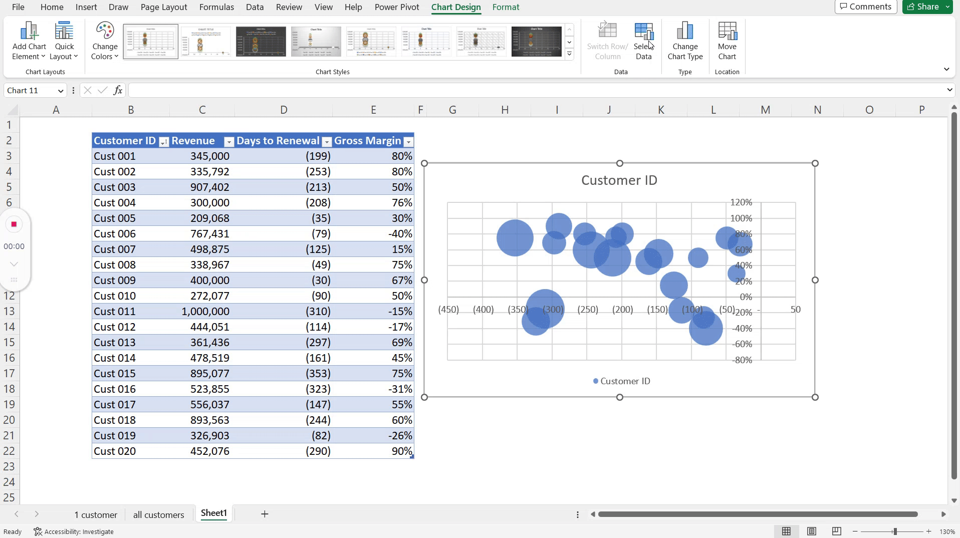
So let’s add all of the customers from our original data table.

Customer 001 is smaller than most.
But that’s not the key takeaway now that we have ALL customers in our visual.
Don’t blink, you now have actionable insights for your Customer Renewals team.
Time to take action
Quick, which customers are losing your company money?

💡Answer: the ones in the red.
Seek to understand WHY they are losing your company money.
Potential reasons could be a combination of:
- Low price point
- High case volumes
- Heavy product usage
Be proactive.
Deep dive into all of these customers BEFORE renewal.
One of them is Customer 011, your biggest customer.
Ask yourself,
“How can you help turn Customer 011 into a profitable one BEFORE renewal?”
❓ Upsell them a new product
❓ Increase their price
❓ Understand their caseloads and reduce them
Make this customer profitable before renewal, and you’ll be a hero.
Your performance review has promotion written all over it.

Other actionable insights you could highlight with additional data:
- Auto approve any discount requests from profitable customers
- Layer in product count information (aka white space) to promote upsell
- Group customers by sales rep to see who sells profitable deals
- Prepare for large waves of renewal volume
- Color code customers based on customer health score
The list goes on, so get creative.
Your turn to create a bubble chart 💭
You can do all of this in Excel.
In less than 2 minutes.
It’s not a push-button solution.
But follow these steps and you’ll have one in no time.
Step 1: Create the chart from scratch
Start with your customer data that includes:
- Customer ID
- Revenue
- Days to Renewal
- Gross Margin
Turn the data into a Data Table by using the shortcut Ctrl + T.
Select Insert → More Charts → Bubble.

The chart now has bubbles, but still needs work.
Step 2: Make the chart useful
Remove all of the Legend Entries (Series).
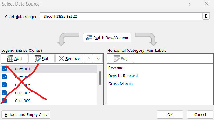
Now Add a new one.
- Series Name linked to Customer ID.
- Series X-axis linked to data in the Days to Renewal column.
- Series Y-axis linked to data in the Gross Margin column
- Series Bubble Size linked to data in the Revenue column.
Step 3: Make it visually appealing
Let’s give each bubble its own color.
- Right-click the bubbles.
- Select Format Data Series.
- Check the box “Vary colors by point”.
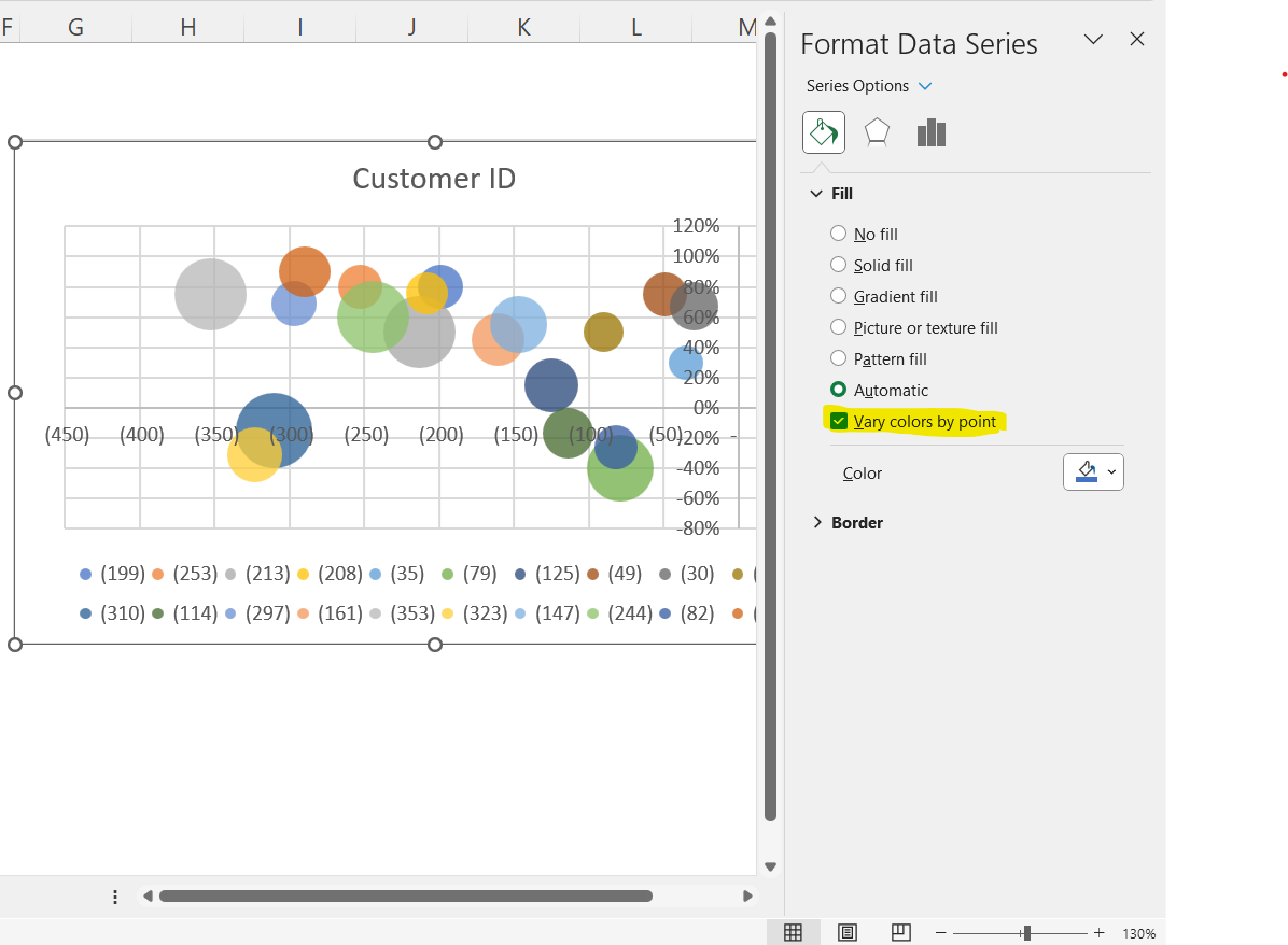
Congrats, you now have a working bubble chart in Excel!
Play with formatting, hide legends, and add shaded boxes as we did.
Less is more when creating visuals for audience consumption.
Conclusion: Renewals look good, so do you
Your job is to add value.
Value is growing revenue, growing profits, and saving costs while making people more efficient.
You literally did all of these things.
With a simple data table and a bubble chart.
Do this consistently and people will notice.
These people will advocate for your promotion and hire you for future roles.
Keep learning simple ways to make big impacts in your job. 👊
How do you feel now? Ready to use bubble charts to generate actionable insights?
Let us know by replying here or emailing us.
As always, let us know if you have any specific topics for us to cover.
Now go have fun making an impact on your company and your career!
Cheers,
Drew & Yarty
PS: This post is 100% human-made